Course platform for personal growth
2015 · Ten Percent Happier · Work
About
Ten Percent Happier is now a leading meditation app in the app store. I joined the team back in 2014, shortly after raising our seed funding. At the time, we were building a course platform for all sorts of personal growth verticals (diet, fitness, productivity, mindfulness, etc). During my time there we launched our first mobile app, produced a dozen courses, and navigated through a few significant pivots to reach product-market fit.
I started at Ten Percent Happier (named Change Collective at the time) as an operations manager and grew into a product role. About a year into my time there, we were running out of seed funding and still nailed down the core of our product experience. I worked closely with the engineering team to rapidly design and launch product experiments and UX improvements. The example below is one conceptual change that we made to our free-trial experience that solved a significant usability issue and led to a 110% increase in conversion from free-trial to paid.
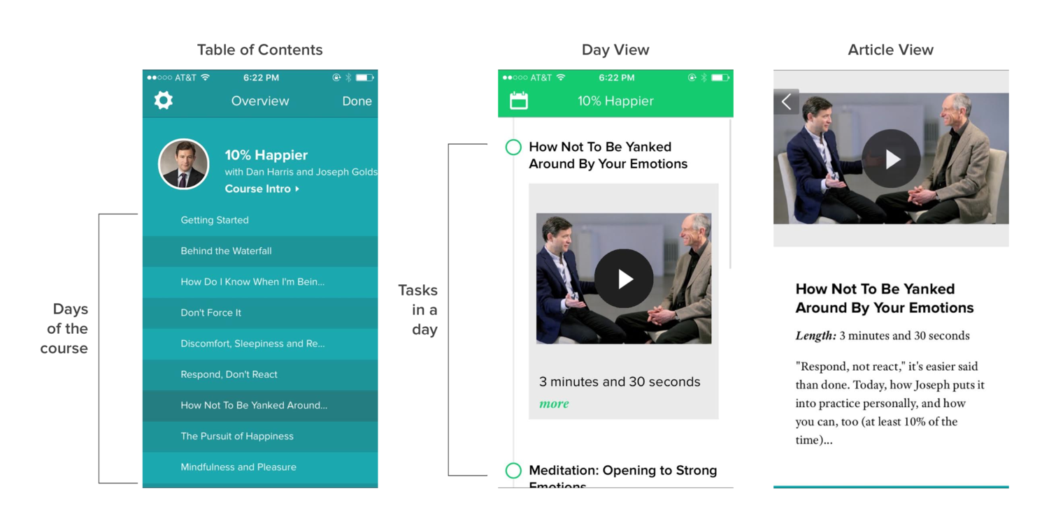
Usability Problem: There were many tasks in a day, and many days in a course. The course automatically advanced to the next day's content each day. The app defaulted to today's tasks. All of this contributed to a problem where users frequently missed days of content, not knowing they could navigate back to previous days' content. This was especially problematic during the 3-day free trial.
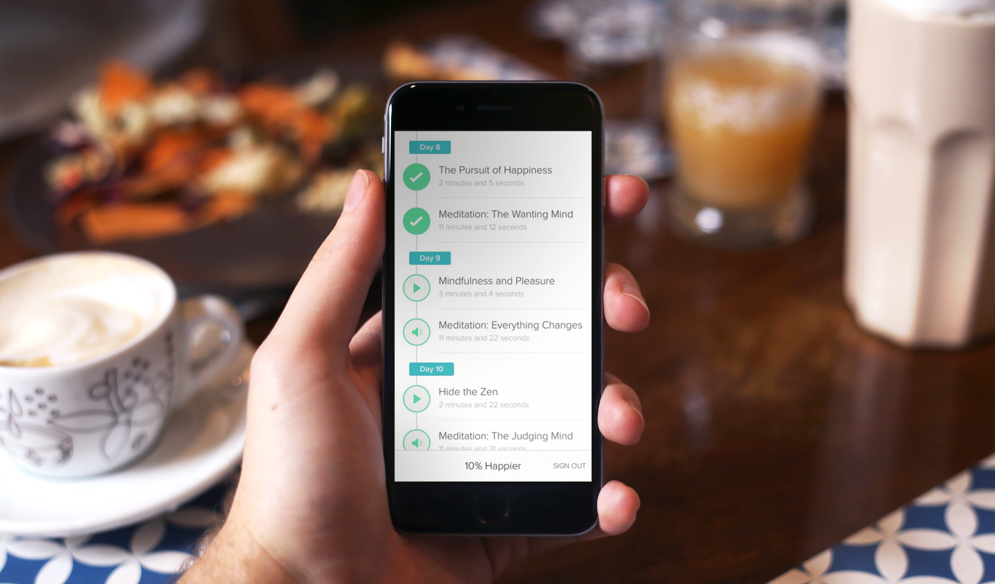
We redesigned the default screen to show the full course (all days, and all days' content) in a single view. Now, when users missed a day in the course, they would scroll past that missed content to view today's content. This simple change led to a 110% increase in free-trial conversion rate.
Up Next
Generate recipes with AI